
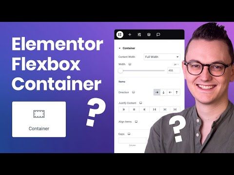
Welcome to the most comprehensive Elementor Flexbox Container Tutorial I’ve ever made. In this Elementor Container Tutorial we will dive into the flexbox in detail by showing different container layouts for desktop and responsive modes.
Check out my Elementor Pro course here: https://livingwithpixels.com/elementor-course (use coupon: LWPYT to get 20% off)
Resource: The percentages you can use for wrapping: https://livingwithpixels.com/resource-flex-grow/
Here is what we are covering
0:00 Introduction
0:50 Container Direction
2:17 The Boxed Container
5:19 Full Width Containers & Widgets
6:37 Aligning items and their content
10:50 What if it doesn’t seem to work
13:26 Justify Content
14:36 Grow
15:52 Element Gap
16:46 Removing container for speed
18:50 Working with Rows
24:05 Using Wrapping to reduce containers
26:24 Elementor Pro Mastery Course
27:25 Order for tablet & mobile
29:30 Clickable Containers
30:13 Turning Auto Padding off
31:15 What about old websites?
→ Software that I recommend
Elementor & Elementor Pro: http://livingwithpixels.com/elementor
Hostinger (Affordable Hosting provider): http://livingwithpixels.com/hostinger
Siteground (Premium Hosting provider): http://livingwithpixels.com/siteground
Figma (Design Software): https://livingwithpixels.com/figma
All software I recommend: https://livingwithpixels.com/links/
Some of the above links are affiliate links, which means that I earn a commission when you make a purchase via my link. Thanks a lot if you decide to do that! I couldn’t make all these videos without it.
source
Recent Comments